
How data visualization can make impact in data analysis
Data visualization involves creating graphic representations of data, ranging from individual data points in scatterplots to statistical summaries like histograms. These visuals focus on presenting raw data and simple summaries, sometimes incorporating transformed data based on complex transformations.
As Daniel Keys Moran said, “You can have data without information, but you cannot have information without data.” This means that data is very important for getting meaningful observation. Using data analysis anyone can really boost a business. Many companies have the potential to be successful, but some struggle to make a profit. By using data effectively, businesses can change the game. It’s not just about collecting data; it’s about creating clear visualization from it.
In fact, Data visualization helps in cleaning and exploring data, spotting outliers and trends, evaluating modeling output, and presenting results. It’s essential for exploring and understanding data before analysis.
Clarity and Comprehension: In data analysis, clarity is important because raw data is often large and filled with numbers that may not be easy to understand. This is where data visualization steps in, providing a visual representation that simplifies complex datasets. Line charts, for example, can illustrate trends over time, making it easier for both technical and non-technical users to grasp the essence of the data.
In the real world, data from an e-commerce website can be a large number. Let’s consider a line chart representing monthly sales figures over a year. This visualization allows stakeholders to quickly identify seasonal patterns, understand growth trends, and pinpoint months of exceptional performance.

Identifying Patterns and Trends: One of the key strengths of data visualization is its ability to reveal patterns and trends that may be intangible in raw data. Scatter plots and heatmaps, for instance, can uncover correlations and distributions that might go unnoticed in spreadsheets. By identifying these patterns, analysts can make informed decisions based on a deeper understanding of underlying data dynamics.
Imagine a scatter plot that visualizes the correlation between advertising spending and the number of units sold for a consumer product. This visual representation not only shows the relationship between the variables but also helps identify whether the advertising efforts are translating into increased sales.

Supporting Decision-Making: Informed decision-making is the heartbeat of any successful enterprises. Data visualizations provide decision-makers with a visual narrative, making it easier to comprehend the implications of various choices. Bar charts comparing different scenarios or outcomes empower leaders to choose paths that align with their goals and objectives.
For decision-makers in retail, a bar chart comparing the performance of different products in a specific month can be invaluable. This visual aid makes it easy to spot the top-performing products and allocate resources accordingly.

Enhancing Communication: Effective communication is at the core of any successful data-driven strategy. Visualizations allow analysts to tell a story with their data, creating a narrative that resonates with diverse audiences. Whether presenting in a boardroom or sharing findings in a report, data visualizations transcend language barriers and engage stakeholders through compelling visuals.
Consider a presentation where a data analyst uses a pie chart to illustrate the market share distribution among competitors in a specific industry. This visual instantly conveys the relative positions of each competitor, fostering clear and effective communication.

Identifying Relationships: Relationships between variables are often complex, but visualizations simplify the process of understanding them. Network diagrams, for example, can reveal intricate connections between entities, aiding analysts in identifying key influencers or dependencies within a system.
In a network diagram representing social connections on a social media platform, influential users and their connections become evident. This visualization helps analysts understand the dynamics of user influence and the structure of the social network.

Improving Data Exploration: Interactive features make a big difference in exploring data. With interactive visualizations, users can dig into specific details or filter information on the go. This hands-on approach helps people understand the data better and discover valuable information.
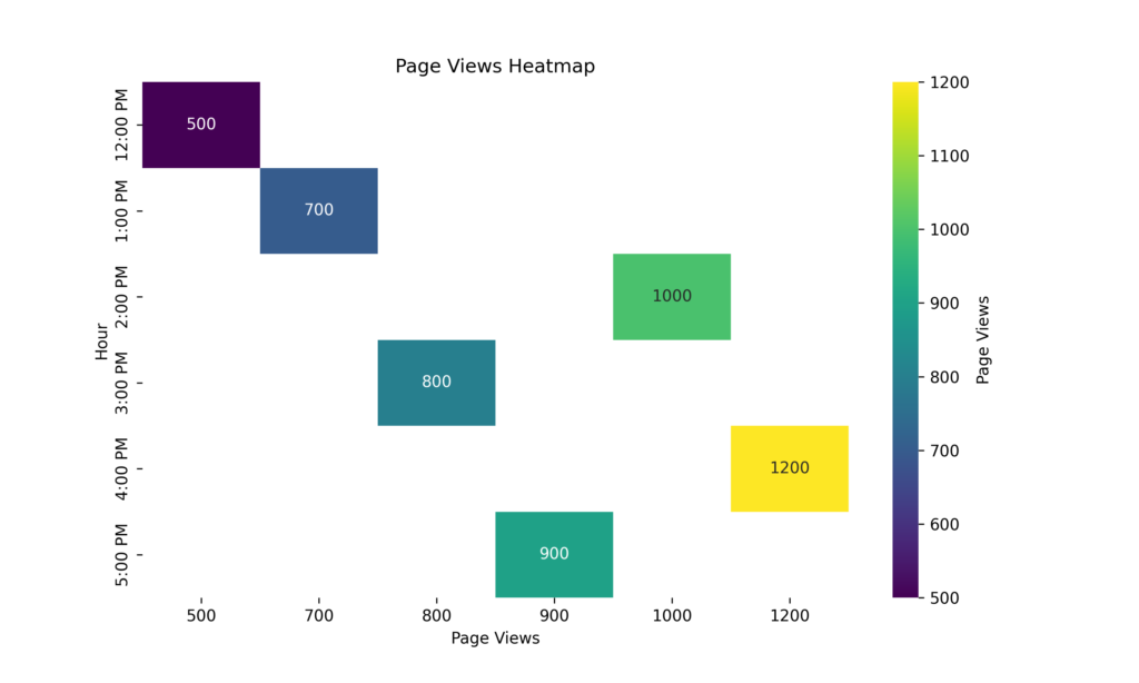
An interactive heatmap showcasing website traffic during different hours of the day allows users to explore data dynamically. This interactivity enables stakeholders to identify peak hours, optimize content delivery, and enhance the overall user experience.
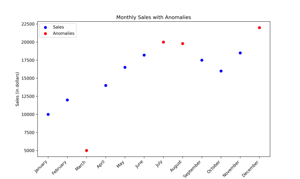
Detecting Anomalies: Anomalies or outliers in data can have significant implications. Visualizations make it easier to spot these anomalies, whether they indicate errors, fraud, or other unusual occurrences. The ability to swiftly identify and address anomalies contributes to maintaining data quality and integrity.
Visualizations excel in highlighting anomalies. Anomalies in a dataset, such as unexpected spikes or dips in a line chart, can be quickly identified, prompting further investigation into potential errors, fraud, or other unusual occurrences.
Facilitating Comparison: Comparative analysis is a fundamental aspect of data-driven decision-making. Bar charts, pie charts, and other visualizations enable straightforward comparisons between categories, helping analysts and stakeholders understand the relative importance or performance of different elements within the dataset.
Picture a pie chart comparing the sales performance of different products in a specific category. This visual representation enables quick and effective comparisons, aiding analysts and decision-makers in understanding which products are driving revenue.

Enhancing Memory Retention: Human brains are wired to process visual information more efficiently than text. By presenting data visually, analysts can enhance memory retention among stakeholders, ensuring that key insights are not only understood but remembered.
Human brains remember visuals better than text. A well-designed infographic summarizing key findings from a data analysis project ensures that stakeholders retain and recall crucial insights.
Promoting Accessibility: Making data accessible to everyone is an important goal for organizations wanting to use their information effectively. Visualizations make data accessible to a broader audience, breaking down barriers and empowering individuals without advanced analytical skills to engage meaningfully with the data.
Using visualizations like bubble charts to represent the relationship between GDP, population, and carbon emissions for different countries makes complex data accessible to a broader audience. This democratization of data fosters a more inclusive approach to decision-making.

In summary, visualizing data is transformative in the world of data analysis. It’s more than just making things look good – it’s a powerful tool that helps us fully tap into what data can offer. As organizations aim to make smart choices using data in a world that’s getting more complicated, being able to use data visualization effectively is super important.